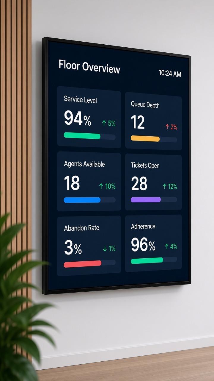
The supervisor sees it, the floor doesn't
A supervisor sees service level slipping on their own screen but is mid-call or mid-meeting before they can flag it to the floor.
When service level slips inside your ticketing or workforce tool, your team finds out after the shift already fell behind. Pickcel puts live operational numbers on screen so everyone sees it the moment it happens.

Trusted by 9,000+ businesses · 150,000+ screens · 70+ countries





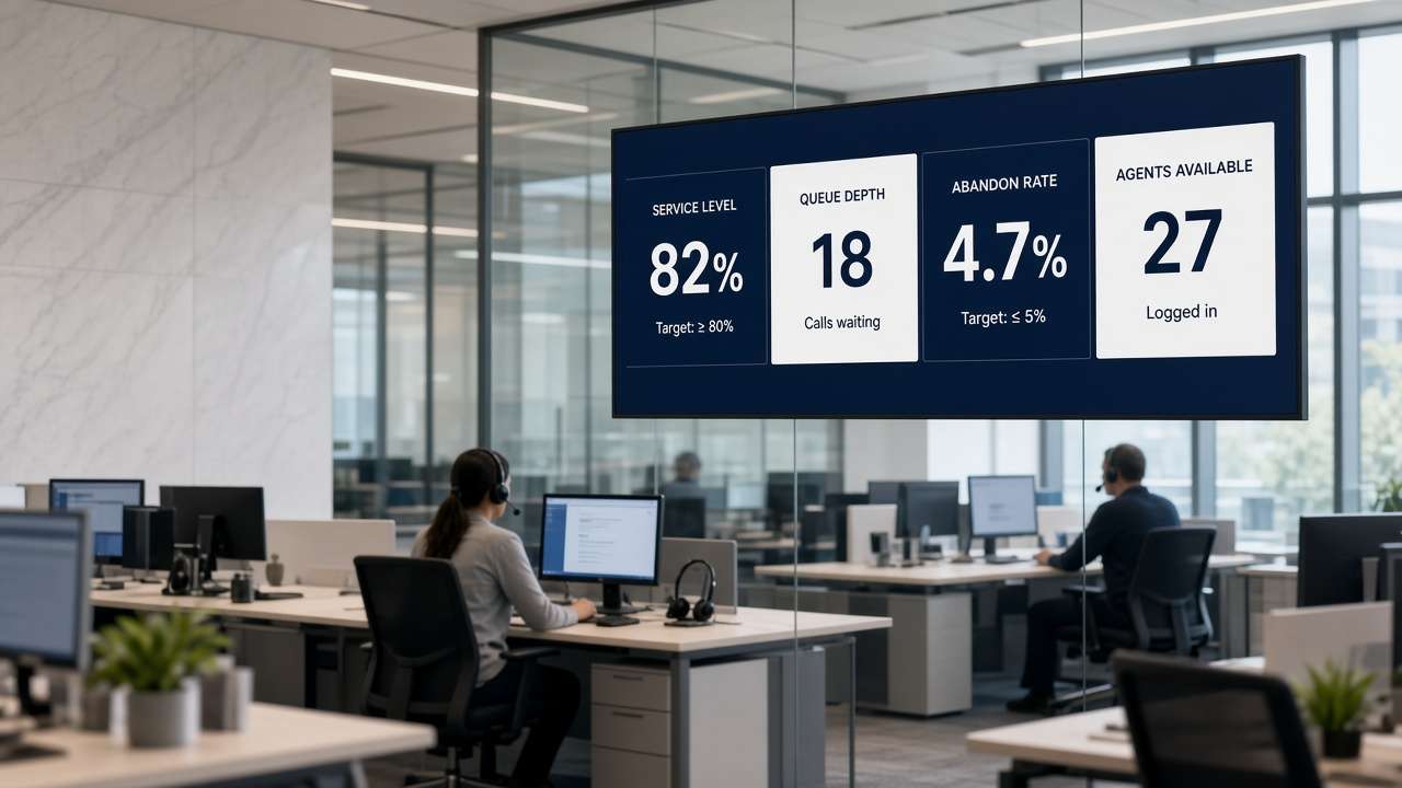
A wallboard is an always-on screen display showing a small set of live operational numbers a team can read at a glance, without opening any application. It differs from a dashboard, which someone opens deliberately to explore a full data set in detail: a wallboard is built to be seen passively, updates automatically, and typically carries three to five metrics rather than a full report. Contact centres, support desks, and delivery operations use wallboards to keep an entire floor aware of the same numbers in real time.
Contact centre, support, and operations floors already run on numbers that exist somewhere: a workforce platform, a ticketing queue, a BI dashboard. The problem isn't that the data doesn't exist, it's that only the people who log into that one system can see it. A wallboard, built on Pickcel's digital signage platform, puts the handful of numbers that matter on a screen the whole floor can read without opening anything, updated automatically, all shift long. For the TV-dashboard side of that same idea, see Pickcel's TV dashboard guide.
Service level, queue depth, and abandon rate usually live inside a workforce-management platform, a helpdesk, or a BI tool that only supervisors and team leads log into. The floor doesn't see these numbers until someone announces them, and by then the shift is often already behind. Three failure modes repeat across contact centres and operations floors:
A supervisor sees service level slipping on their own screen but is mid-call or mid-meeting before they can flag it to the floor.
Metrics live in one system per team (a phone platform, a ticketing tool, a sales CRM), so no single screen shows the full operational picture.
Shift handovers lose context: the incoming team starts cold because the numbers that mattered to the outgoing shift were never visible outside one manager's laptop.
workforce, ticketing, BI, spreadsheets
combines feeds, schedules by shift, caches on outage
always-on, no app to open
whole team, every shift
Problem you have today
Supervisors see slipping numbers before the floor does
How Pickcel handles it
Pulls live data from your workforce, ticketing, or BI tool onto always-on screens
What you get
The floor sees a number change the same moment the supervisor does
Problem you have today
Each team's metrics live in a different system
How Pickcel handles it
Combines feeds from more than one source on a single screen
What you get
One wallboard instead of five browser tabs
Problem you have today
Shift handovers lose visibility of what mattered
How Pickcel handles it
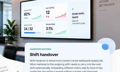
Schedules different metric sets by shift or team automatically
What you get
Incoming shift starts with context, not a cold start
Problem you have today
A data source goes down mid-shift and the screen goes blank
How Pickcel handles it
Caches the last known state and flags it as stale rather than showing an empty screen
What you get
The floor knows the data is stale, not missing
| Problem you have today | How Pickcel handles it | What you get |
|---|---|---|
| Supervisors see slipping numbers before the floor does | Pulls live data from your workforce, ticketing, or BI tool onto always-on screens | The floor sees a number change the same moment the supervisor does |
| Each team's metrics live in a different system | Combines feeds from more than one source on a single screen | One wallboard instead of five browser tabs |
| Shift handovers lose visibility of what mattered | Schedules different metric sets by shift or team automatically | Incoming shift starts with context, not a cold start |
| A data source goes down mid-shift and the screen goes blank | Caches the last known state and flags it as stale rather than showing an empty screen | The floor knows the data is stale, not missing |
Show the right numbers. Drive real action.
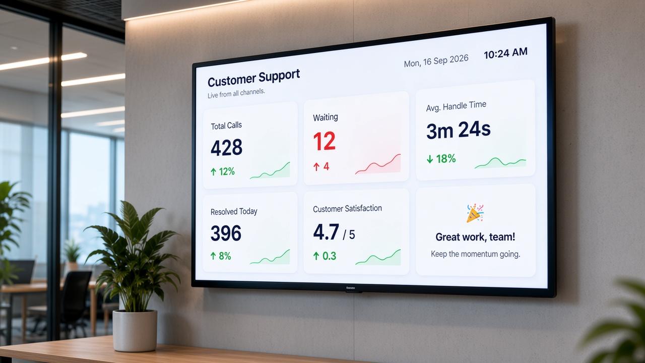
Most wallboards fail because they try to show everything. A screen seen from 20 feet away can't carry the same detail as a dashboard. After about five numbers, people stop noticing the changes.
The sweet spot is 3–5 metrics per screen — enough to be useful, but focused enough to get attention. Choose numbers that need actions in the next 10 minutes, not the ones that just look good in a monthly report.
Use colour with purpose. Reserve red, amber, and green for numbers that cross a threshold — not for every header or tile. And keep it live: a number that updates every 30 seconds feels real; one that updates every 10 minutes feels like yesterday's news.
Keep it relevant
3–5 metrics
The ideal range for a single screen.
Make it actionable
Next 10 minutes
Show numbers that need a response now.
Use colour wisely
Signal change
Red, amber and green only for thresholds.
Same goal. Different views. A better-performing floor.
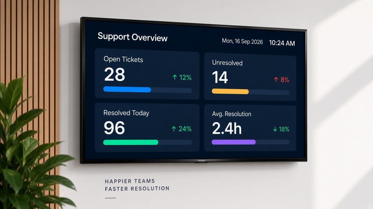
A call centre wallboard usually needs to answer one question at a glance: is the floor keeping pace with what's coming in right now. That means a small, well-established set of metrics: service level, queue depth, abandon rate, agents available vs on a call, and adherence.
Supervisors and agents don't want to see the same thing. A supervisor's version can carry more detail, while an agent-facing wallboard works best simplified to two or three shared numbers. Running both from one platform, with different metric sets per screen or shift, is what separates a wallboard built for the floor from a generic report pointed at a TV.
01
Right information
for the right people
02
Real-time visibility
across the floor
03
Smoother handovers
and better performance
The same wallboard approach works across teams — different data, different goals, but a clearer way forward.
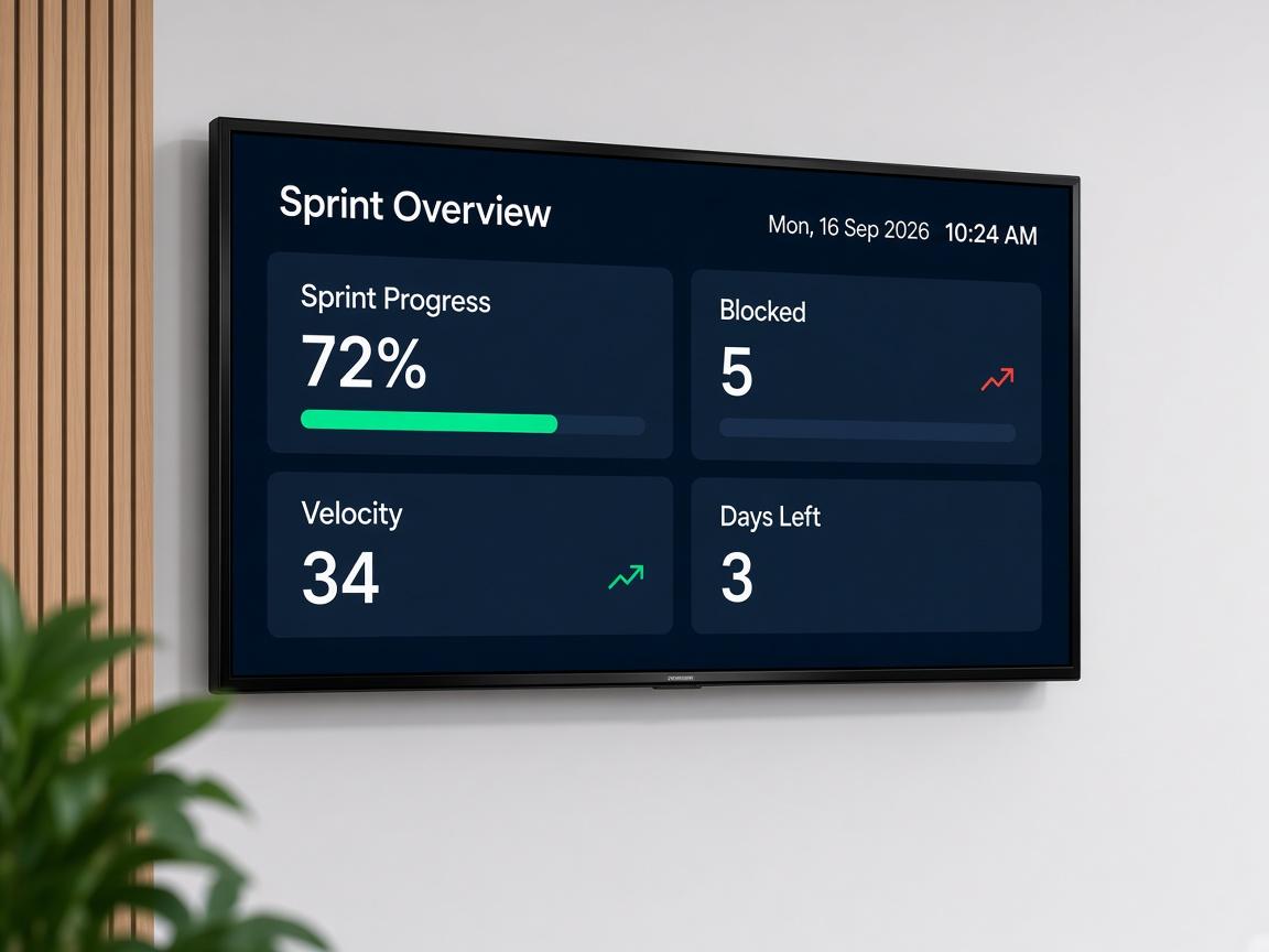
Clearer sprints Fewer surprises
Burndown at a glance
Blocked work visible
Standup starts aligned
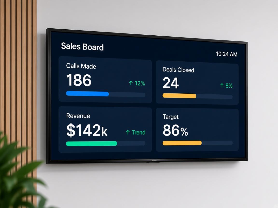
Live against target Visible momentum
Calls and deals live
Progress against target
Built for the floor
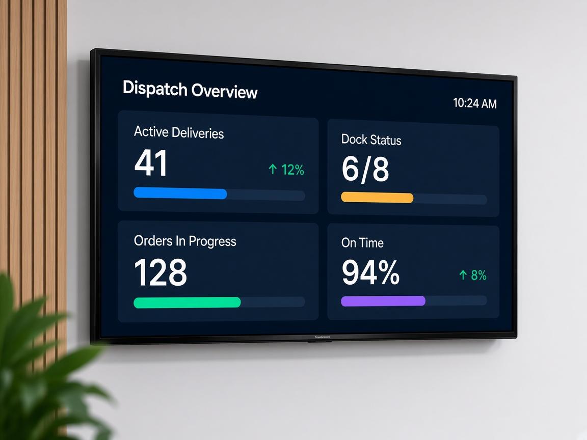
Dock to door Live status
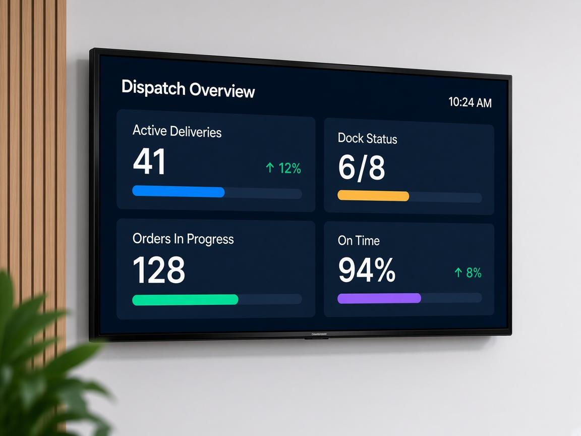
Active deliveries
Dock status in view
Orders in progress
Connects to workforce platforms, ticketing tools, BI sources, and spreadsheets at once, instead of one tool per screen.
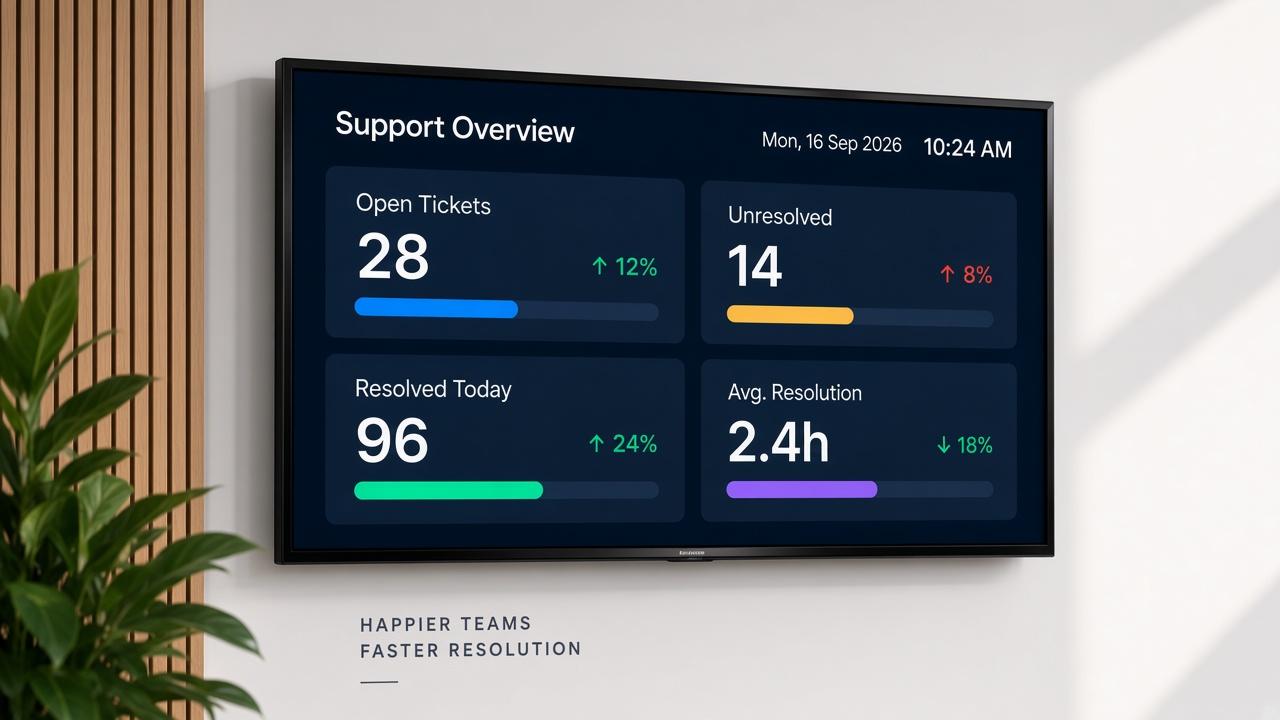
Runs independently once configured; recovers automatically after a network drop or a screen reboot.
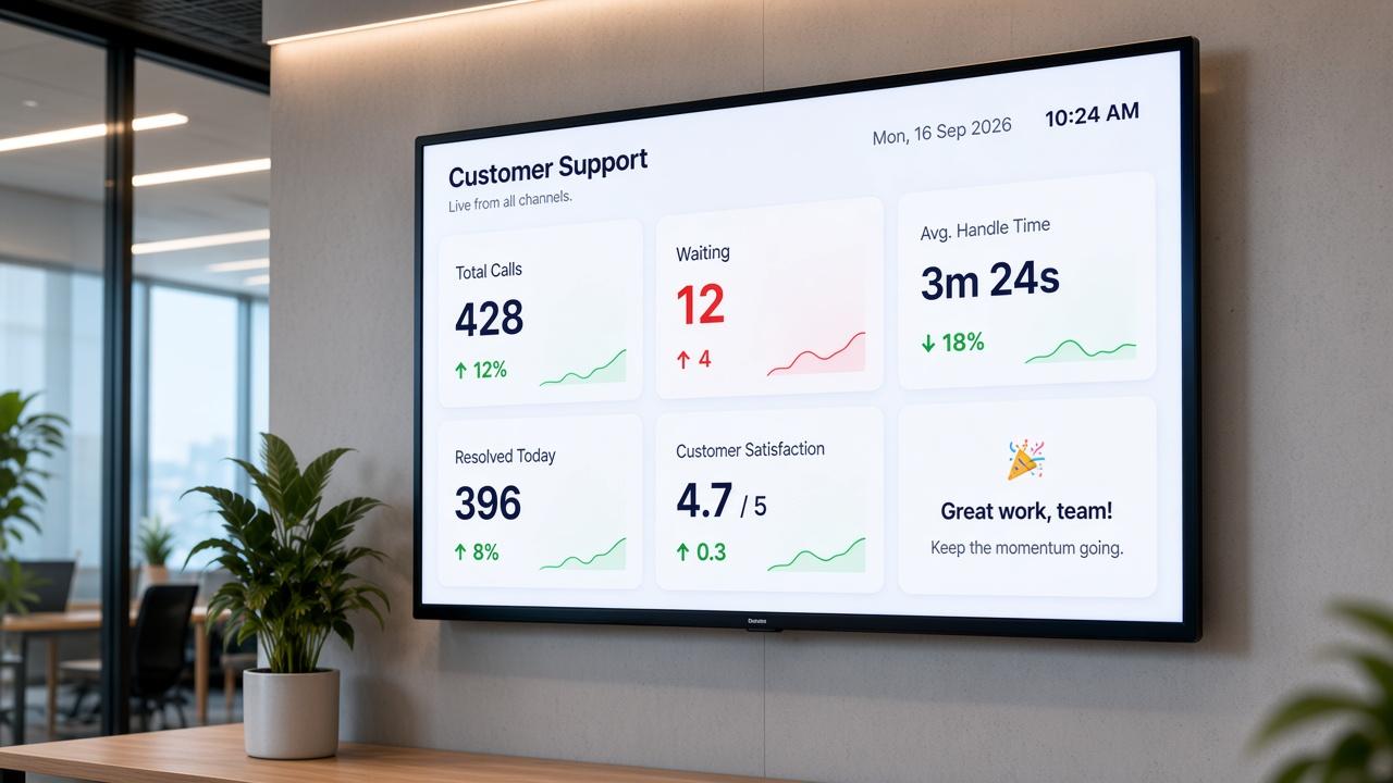
Metric sets or layouts trigger automatically by time of day or team, so the wallboard already shows the incoming shift's priorities.
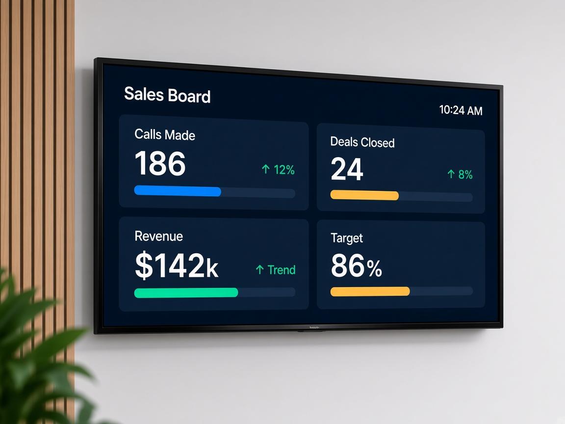
Manage every wallboard across every location from one login; push a layout change to fifty screens as easily as one.
If a source goes down mid-shift, the screen shows the last known state with a stale-data flag instead of going blank.
Pickcel is SOC 2 Type II and ISO 27001 certified, so IT and security teams reviewing a new screen on the network aren't starting the conversation from zero.

A wallboard is only as good as the systems feeding it:
Most wallboard deployments combine two or three of these on the same screen, which is the specific gap a platform's own built-in wallboard view can't close. For BI-tool integration depth, see Pickcel's dashboard integration hub.

Contact centre and ticketing platforms: helpdesk and support tools where queue depth, ticket volume, and resolution time already live. If your support queue runs on Zendesk specifically, that connection already has a dedicated template rather than a custom build.
BI tools: Power BI, Tableau, and similar platforms, for teams that already build their metrics there and just need them on a screen the floor can see.
Spreadsheets: for teams tracking numbers in Google Sheets or Excel before adopting a dedicated platform.
Workforce management systems: for adherence, schedule, and staffing data.
Most contact centre and workforce platforms already ship a wallboard view, and it's a fair question why you'd need anything else. The honest answer: that built-in view shows its own platform's data, on one screen, on its own schedule, and nothing more.
It typically can't combine a second system's data (a ticketing tool, a BI dashboard, a spreadsheet) on the same screen, can't run the same layout across multiple sites from one login, and usually goes down with the platform itself during an outage instead of continuing to show cached data.
Pickcel isn't a replacement for that built-in view. It's the layer that sits above it when a team needs more than one system's data on the wall, more than one site managed centrally, or a screen that keeps working when a single platform hiccups.